 WARNING.
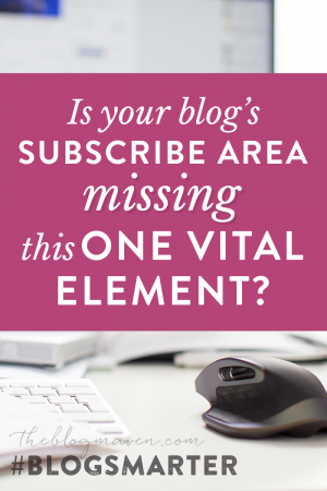
There’s a silent killer prowling your website.
It starts out as a simple oversight — something you forgot to add when setting up your mailing list. But as your traffic grows, the effects of this disease multiply.
This condition often goes undetected for years…because you THINK it’s “taken care of” (you have a pop-up, after all!)…but unless you strike gold with a viral post, you might not ever understand just how deadly this disease truly is.
(Don’t even bother reaching for the antibiotics on this one…this super bug is resistant.)
Left unresolved, this condition will keep you from converting visitors to subscribers – so you’re forced to sit there and watch your traffic slip through your fingers.
And by the time you realize just how quickly people are leaving your website (never to return again)…it’s too late.
::
Believe it or not, THESE are all symptoms of the same disease:
Symptom #1: “It doesn’t matter how many blog posts I publish or how much time I spend on social media. People visit for a minute or two, and then they leave. They don’t subscribe, and I never see them again.”
Symptom #2: “My email open rates are TERRIBLE. I write a blog post and send it out, but less than 20% of the people on my list even OPEN it!”
Symptom #3: “Plenty of people join my list, but as soon as they download my free e-book, they unsubscribe. My sales funnel is more like a sieve.”
On the surface, this seems like three different problems, but it’s not – they’re all symptoms of the same disease: a weak brand.
But even as you’re working on building your brand, you don’t have to just sit there and watch hundreds – thousands – of visitors slip through your fingers.
You can treat the symptoms of the disease by patching up the gaping hole in your subscribe machine — even while you work on wiping out the disease itself.
The vital element missing from 99% of subscribe boxes
In order for people to subscribe, you have to ask them to subscribe. Pretty basic.
But in order to illustrate what you SHOULD do, I’m going to show you a few examples of when it’s done badly:
Lame Subscribe Box #1: The Newsletter
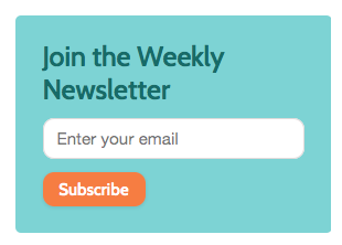
You know…when I rolled out of bed this morning, the first thought that came into my head was…I want another newsletter.
cough.
Now, I’ve worked with hundreds of bloggers…and I’d bet good money that this blogger doesn’t send a weekly newsletter. Because she’s too tired.
But even if she does, she has a teeny, tiny fraction of her traffic actually signing up for said newsletter…because WHY WOULD THEY?
“Join the weekly newsletter” is about as compelling as “Get your teeth cleaned.” Which some people remember to do, but NOBODY is standing in line for.
Which brings us to…
Lame Subscribe Box #2: VIP Access

So…somewhere online, this blogger heard it was a good idea to sound cool.
Like, if you can make people think your blog is actually a trendy night club, you’ll trick them into subscribing before they figure out that “ladies night” actually means “creepy dudes who want a 10:1 ratio of vinyl-clad college girls to dateless desperadoes.”
VIP ACCESS TO WHATTTTT???
NO, you can’t have my phone number email address!
(that was from a food blog, BTW. Seriously weird.)
But as creepy as that one is, at least it’s more interesting than…
Lame Subscribe Box #3: The “Update”
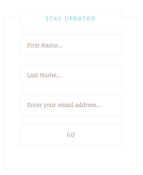
Aside from the fact that this subscribe box completely blends in with its surroundings (look kids…camouflage!), we’re looking at Yawn Fest Five Thousand.
You want my first name…and my last name…and my email address…so I can go…WHERE?
Can I give you my social security number, too? Will it keep me MORE updated?
And what am I going to be updated ABOUT?
If you pulled up to a red light and saw a guy waving a posterboard sign that read “UPDATES! (They’re FREE!)”
…would you stop?
Because that’s what you’re asking your reader to do.
You’re asking her to stop reading – to step away from the “back” button – and enter her email address to join your tribe.
Surely you can offer something more compelling than an update.
The vital element that’s missing from every one of these subscribe boxes…
…Is WHY?
WHY should the reader sign up for your email list?
WHY should she care?
What’s in it for her?
If you can’t tell your reader WHY she should subscribe, she’ll never know.
(Tweet that!)
…so what does a good “WHY” subscribe box look like?
There are lots of ways to do this well, but to illustrate, I’m going to show you a few examples from awesome grads of my Blog Smarter program. These ladies are rocking their subscribe rates.
WHY #1: Ana from Babble Dabble Do
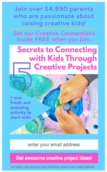
First of all, Holy exploding balls of color, Batman! (but color is one of Ana’s trademarks – totally on brand for her.)
Second of all, Ana’s readers are parents and teachers who want to connect with kids via creative projects. This subscribe area says exactly why they should subscribe.
WHY #2: Heather from Big Girl Life
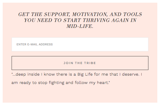
Why should they subscribe, you ask? Because they’ll get support, motivation, and tools to thrive mid-life.
If you’re a 40-something woman who has put her dreams on hold while caring for everybody else, this subscribe box makes you say HECK-to-the-YES.
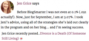
WHY #3: Jen Grice
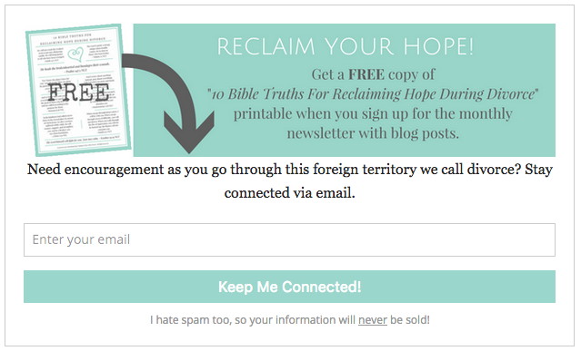
Here’s a blogger who has undergone a H-U-G-E pivot in her business. And it’s paying off. In last week’s post about How to Calculate Your Conversion Rate, Jen commented…
Scroll back up to her subscribe box. See the WHY?
Hope. Encouragement. Connection. Which calls out exactly to the target market (Christian women who have been through divorce) Jen serves.
But not all WHYs have to be this touchy-feely. They can be super practical, as well, like…
WHY #4: Rachel from The Country Contessa
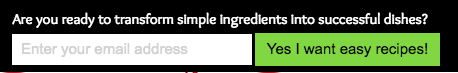
Sure, Rachel has other subscribe areas on her site that are more beautiful. But this is a little strip that appears at the top of her site, and I’m showing it to you because it doesn’t have to be beautiful.
The words here are simple, but they’re powerful. The WHY reaches out and seizes her reader by the ears. And this is one reason Rachel is now getting over 800 new subscribers per month.
Want more proof that it doesn’t have to be beautiful? Even though this next blogger has LOTS of other gorgeous subscribe areas on her site, this one is sleek and simple. It does the job.
Take a look at…
WHY #5: Shannon from AKA Design
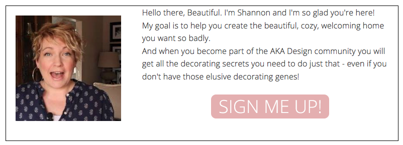
Decorating secrets. A beautiful, cozy, welcoming home.
When Shannon’s target market gets to the bottom of her post, they don’t just say okay.
This subscribe box has them nodding their head and reaching to click before they’ve finished reading the second sentence.
It’s time to turn your Blah into Brilliant.
Sure, the blogosphere is crowded…but for the most part? It’s shoulder-to-shoulder sameness.
In order to stand out — in order to get readers to hand over that precious email address — you have to be able to clearly articulate WHY. What’s in it for them?
Now, I wouldn’t recommend just snagging a word or two from these examples…because they were all crafted carefully after each blogger did some intense research for creating a new brand.
(…And lifting something from someone else’s business – even if they write about similar things – is a recipe for DISASTER if you have different readers actually showing up on your site.)
But here’s what you CAN apply:
The “why” is a part of building a stronger brand…and you can get quick wins by adding just a few words to some strategic subscribe areas. So even as you’re on your quest to kill off the disease of weak branding, tackle the vital element of WHY.
In order to answer the question of “Why” for your readers,
You’re going to have to answer that question for yourself.
And when you do?
It’ll be your best defense against blending in.
No antibiotics required.
Ditch the blogging Rat Race for good.
Once or twice a year, we open up doors for the Blog Smarter mentorship program, where you get the exact step-by-step process for turning your blog into a powerful brand so you can quit the endless cycle of publish-promote-publish-promote and step up to being a CEO.
But fair warning: Seats sell out FAST (every single time the doors have opened, we’ve had to close doors early!). Join the waiting list here, and you’ll be the first to hear when enrollment opens.