Leave a Comment:
191 comments
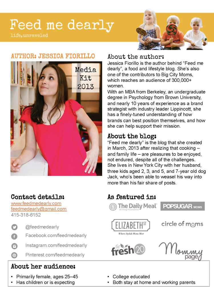
Please leave feedback for Metropolitan Organizing here.
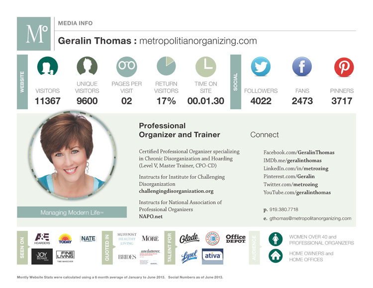
ReplyWe love the icons + numbers. Anyone can have a quick glance + clearly understand what your readership/social media is like (we want to do this!). Again, love the logos for ‘seen on’ ‘quoted in’ ‘talent for’ but also feel like you could elaborate further on a couple (this may be on another link that we missed?). This will show what amazing things you have already done + show others that they not only want to work with you but they need to work with you! You have worked with some impressive + very (very) well-known brands + businesses. This could be a highlight of you media kit!! Thanks for sharing your media kit, we have definitely picked up some things we’d like to add to ours! Emma + Carla.
ReplyThank you Emma + Carla!
I have a One-Sheet in addition (which brands usually request once they get a little more serious) and that typically answers questions about what else I’ve done – especially with speaking engagements, education, etc.
I sincerely appreciate you taking time to make suggestions – all very helpful.
ReplyHi Ian,
Really, you want to go for 1-2 pages on your media kit, since the point is just to help the brand you’re wanting to work with imagine what it would be like to work with you, and how much value they’d get from the collaboration. When you go much longer, you risk them not reading it at all. There are other pieces to your interaction, like emails and your formal “pitch” after they’ve seen your media kit, so on the kit itself, if you can say it on 1-2 pages, then do. 🙂
Hope that’s helpful!
Very nicely done. All the information is there without overloading the eyes with too many words. Great graphic with a nice, clean layout. Great job!
ReplyThank you Marty! I’ll be changing a few things later this month based on feedback but for the most part, I’m happy with it.
ReplyI love how you include your target audience Geralin! Great way to specify to brands exactly who they’ll be reaching through you. I also like how your format is different than a lot of other people’s in that it’s landscape, rather than vertical. Your face is up front and clear too – very personable!
I’m not sure I have a ton of suggestions except maybe to make your social accounts clickable if they aren’t already. Great to meet you!
ReplyKristy, I like to just “put it out there” regarding my “dream audience” so that was a whim . . . I’ll know more about how that’s working for me (or not!) in the future. Clickable social accounts is a genius idea. Thank you.
ReplyCheryl, Many thanks! It’s funny because I usually zero in on people’s social media info too. We must be extraverts + love socializing?
ReplyPeace! I have been cruising the internet during Women’s History Month to find new blog and entrepreneur inspiration and I came across your blog. Lovely work!
To answer your question, I was most drawn to minimalist looking the press kits that had soft colors. The ones that were simple, informative, and quirky caught my eye.
Glad you found me then, Ra 🙂 Hope you enjoy exploring the site – my focus is on creating timeless resources that will help bloggers, no matter what phase of blogging you’re in.
ReplyWOW! We love your media kit and your blog for that matter! Your blog design is beautiful and so nice to look at! The great thing about your media kit is that it is sharp and to the point. You tell potential businesses who you are, what you can do for them and why they’d want to work with you. The way you outline your demographic is a fantastic idea too – creates a selling point to the businesss, especially if they allign! Your stats are easy to see and obvious which is great. Something that might be good to add are some testimonials from readers or businesses, how you’ve changed people’s lives for the better or how you have assisted a business increase their business! It might be nice to also add some example images, you have some really great photos in your ‘project gallery’ that would be a great example of the work you can do. Even if you turned your media kit into a two pager, with your original media kit stlye first and then a full page of example images and descriptions. Your contact info is really visible which is also a huge plus! They’ll know where to click/who to email if they’re interested without having to search for it. Overall, we think your media kit looks very professional and it’s consistent with the design of your blog! 🙂 Hope this helps!
ReplyThanks so much for the feedback! The photos are a great idea, I was just worried about making it too long, but I guess a second page wouldn’t hurt!
ReplyI think my favourite think about your media kit is how it’s branded to align with your audience and the companies who would be inclined to work with you. It’s very clean, feminine and pretty – nicely done! I also like how your contact info is *BAM* right up front!
My only suggestion is to maybe get an email address beyond Hotmail. Gmail would be better if not a custom or self hosted email addy. The reason I say this is just because you want brands to take you seriously – you need to show them that you take yourself seriously first. Hotmail accounts tend to illicit images of spam or 12 year olds. And you are clearly much more talented, interesting and useful than either one of those things 🙂
ReplyThanks for the idea Kristie. I have considered a new email, but I had an established catering business before blogging and when I started I just kept it the same… and had 500 business cards printed! I know its something I have to resolve, thanks!
ReplyI love this one! The colors are great and all of the information that I would want is easy accessible.
I agree with the email address comment that Kristy posted, and my only other advice would be to use a simpler font when listing your website address– you don’t want anyone to have to squint through cursive to make sure they’re getting the spelling correct.
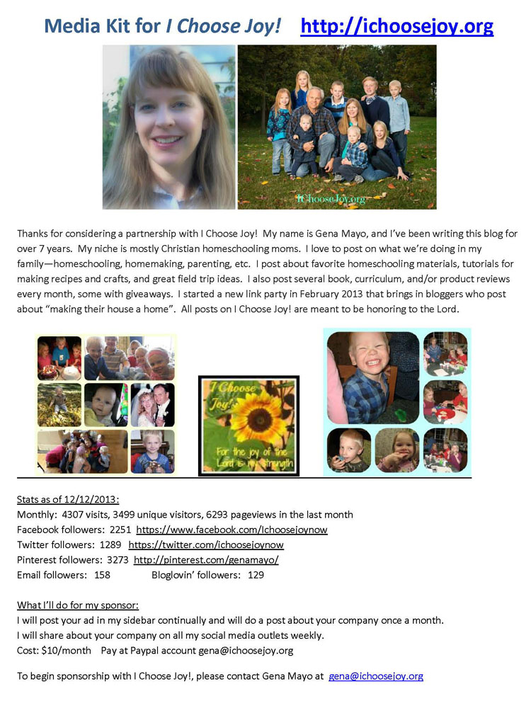
ReplyHello from a fellow homeschooling mama 🙂 What a wealth of information you have on your blog! I just popped in to take a peek….. I do have one tiny suggestion for your media kit. I would consider moving the text to be all together, as opposed to having text, photos, text. Maybe have the photos at the beginning & end to ground the look of things? Just a thought. Your children are beautiful! All those happy smiles 🙂
ReplyGirl – I straight up LOVE your honest and bold stance for The Lord. What a blessing to see that! 🙂 Your children are obviously a huge part of your blogging life and I love that you’ve included pictures of your family. Love, love, love it!
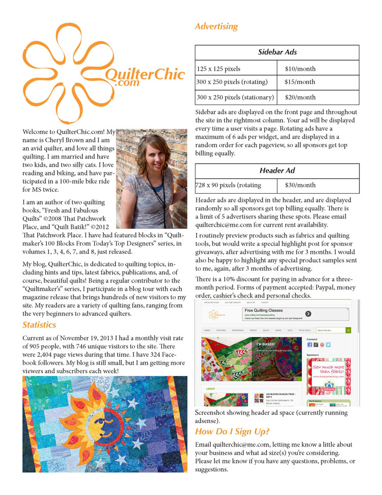
I would suggest that your pricing is too low. Your time is worth more than $10/month. You’re investing in another business and that takes time. Up your prices….you’re worth it.
I would also suggest offering some other options for advertising.
Now, go get ’em! 🙂
Gena your media kit has so many lovely pictures! You definitely DO look like you choose joy 🙂
I have a similar recommendation to the above mentioned one. I would think about breaking things up with boxes, colors or justified text in columns to clean it up a bit, rather than just have it be typed out the way it is now. It’s great that you give a good run down of your blog and what you talk about – it just needs a little styling.
I’d also suggest including, either along with or instead of – a few images of your posts. Family is wonderful – especially since that’s what get your joy from. But you have lovely content beyond that and you should highlight it!
ReplyHi Tom! You’ve got some great stuff here to start out and after reading your “about” section, I feel like I have a pretty good grasp on what you like to do.
To make your media kit pop more (right now it does look a touch like a resume), you could consider adding a head shot, list who you’ve worked with, and definitely include how people can easily contact you both via your website and social media accounts.
I feel like right now you have a good idea as to what you want to do, now you have to sell it to others 🙂
ReplyThank you so much for the feedback, after seeing all the other ones here today, I see that mine does pale in comparison but I will soon fix that! 🙂
ReplyThe information is great! I would definitely add some graphics or photos to keep people scrolling and give them that instant visual verification of what they’re looking at.
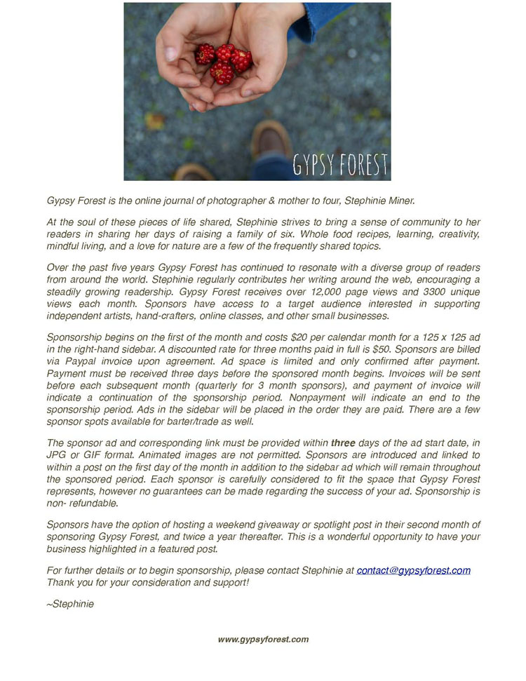
ReplyHi Stephanie!
I have seen your advertisements and name around for years, on Soulemama or other blogs, on Waldorf courses or listserves. In short, I believe we run in the same circles!
Your beautiful photographs are one of the most delightful parts of your blog; could you pepper your media kit with a few more photos that capture your lifestyle?
I love how clearly you lay out the terms of your partnership. I wonder if they would be easier to read if they were in bullet points?
And my last suggestion would be to use a few subheadings to draw attention to different parts of your media kit – for instance, Rates, or “The Fine Print”.
You have a lovely blog and business! I look forward to saying hello sometime soon.
Best,
Teri
Hi Stephinie!
I agree – you have wonderful content and the image you have up front is beautiful! It makes me want to read more! I think a few headings/subheadings and a bit of formatting would really take your kit to the next level. You obviously take great pictures too so it might be worthwhile to try introducing a couple of those.
ReplyMy initial thoughts are right along the same lines as the other comments here. I really like the image you included and I want more:) I also think that breaking up the text with more headlines and bullets would make it easier to scan.
I also think the italicized text for the entire page makes it a bit hard to read. Other than that, I think it looks great.
ReplyI absolutely love your images! Your media kit is very thorough….. but I wonder if it’s a tad too long? Also you might have a typo on the first line in page 3. Should it say “lie” or “life”? If it is a typo, we much be kindred because I do the same thing all the time. Even though I proof read the voice in my head knows what it should say, so I often miss little typos.
ps ~ the New Year’s Picture of the dogs!!! Love!!
Your media kit is so great! I love all the images of your family and how thorough it is! It definitely contains all the info any particular sponsor could ask for 🙂 I also love that you’ve broken up the content with images and bullet points.
I do agree with Stephinie though about the length. Everything you need to tell them should fit on 1-3 pages – sponsors are busy people/companies and most people will see the page count and miss all the fabulous info. Perhaps think about which info & images are the MOST relevant to potential sponsors and consider adding pages as a drop down on your website so the stuff you cut is still accessible.
ReplyI really like how you broke up the text with images, and the bullet points on page 2 makes it easy to skim through the stats.
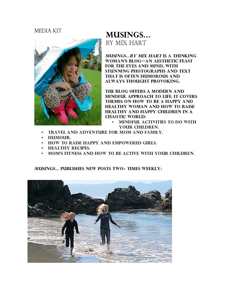
I did think that the all caps font was a bit hard on the eyes. Maybe you can use that font for the headlines and a lowercase font for the body. I like that you have testimonials in your media kit, but maybe you can consider using boxes or some other graphic treatment to break them up and make them stand out more.
ReplyHi Angela!
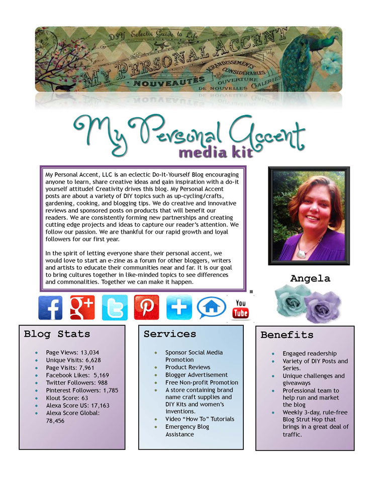
I love the front page of your media kit – it’s nicely organized, you have a great profile shot, you’ve included your banner, your social profiles (I’m assuming those are clickable?) and I can see your stats. I tried to look at the full thing but when I click through to your page, can’t actually find it. This might be something you want to look at – potential sponsors want info upfront, so you want to make it as easy as possible for them.
My only other note is that, 16 pages may be a tad long. As I mentioned on one of the other media kits, everything you need to tell potential sponsors should fit on 1-3 pages tops – they’re busy people/companies and most will simply see the page count and miss all the fabulous info. Perhaps think about which info & images are the MOST relevant to potential sponsors and consider adding pages as a drop down on your website so the stuff you cut is still accessible.
ReplyHi Angela,
I also really loved the front page of your media kit because it was a nice snapshot of your stats, social profiles and available opportunities. But I was also a little confused when I clicked through and couldn’t find it.
I absolutely love how you have links to buy your ads right next to the description and costs – I also use OIO publisher so I might have to steal that idea:) I think it’s super convenient for advertisers.
I think that the media kit could use a few more images/graphics to break up the text. I also found the white text on the light background really hard to read. I’m not one to talk because I have a similar treatment on one of my media kit slides:) I guess I never realized how hard it is to read white font.
ReplyHi Angela,
I just wanted to give a shout out and say thanks for sharing your media kit with everyone. As a few other people noted, we weren’t able to find the full media kit on your Advertise page, but I had the benefit of looking at the full document you sent. I really like that you show the personality of your blog, both through the words you use and the design of the kit. You definitely know what you’re about, and it shows!
In looking at the kit as a whole, I agree that it’s too long. There are a number of pages where you’re sharing images of your social media accounts and of the contributing writers on your blog that could be drastically condensed. Remember: the goal of a media kit is to give a potential brand sponsor a brief overview of what sponsorship on your blog looks like – what types of topics you write about (which you showcase well!) and what types of products/services your readers are interested in. The point is for the sponsor to be able to envision their sponsorship relationship with you and see the value you’ll be providing to their company.
I think that condensing your media kit will benefit you in another way, as well: it will make it easier for you to update in the future and lower your administrative energy to run your sponsorship program.
I hope you’ve gotten a lot out of this experience and truly appreciate your generosity in sharing your kit with everyone!
Warmly,
Jeni
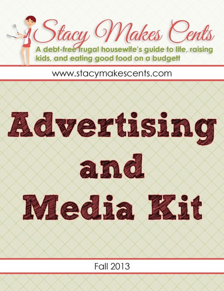
I loved the main page information. It made me want to click & download the media kit. I have one suggestion. As a small business owner, my time is valuable. Chances are if I clicked on your link through your website, I already really like what your doing. I’m just not sure if I want to read 14 more pages about it. Can you condense it just a little? Lastly, loved your blog! I just spent twenty minutes perusing around 🙂
ReplyStacy! I love your blog and have been stalking you for a while now. Your media kit is great – super comprehensive and lots of valuable information! I’m with Stephinie (again – we seem to agree a lot! haha) and I think that your kit is a touch too long. As I mentioned for a few of the other media kits, everything you need to tell potential sponsors should fit on 1-3 pages tops – they’re busy people/companies and most will simply see the page count and miss all the fabulous info. Perhaps think about which info & images are the MOST relevant to potential sponsors and consider adding pages as a drop down on your website so the stuff you cut is still accessible. Otherwise, adore you! 😉
ReplyI enjoyed the layout and feel of your media kit. The stats are communicated clearly and effectively, and I like that you have a form connected to your media kit, so potential advertisers can take action right there and then!
I guess my main feedback is that I wanted to learn more about your blog and business. If I was brand new to your website, I don’t think that your media kit would give me enough information to know what kind of content I might expect, or if my values would be a good fit. Could you tell more of your story?
I also am a big fan of photos, so I’d love to see some delicious foods, or other photos to pique my curiosity.
Best of luck to you!
Teri
Thanks ladies! Those are easy fixes. I admit that I often do that in the body of my email, but I can easily add a few blurbs to make sure that’s included.
I appreciate it <3
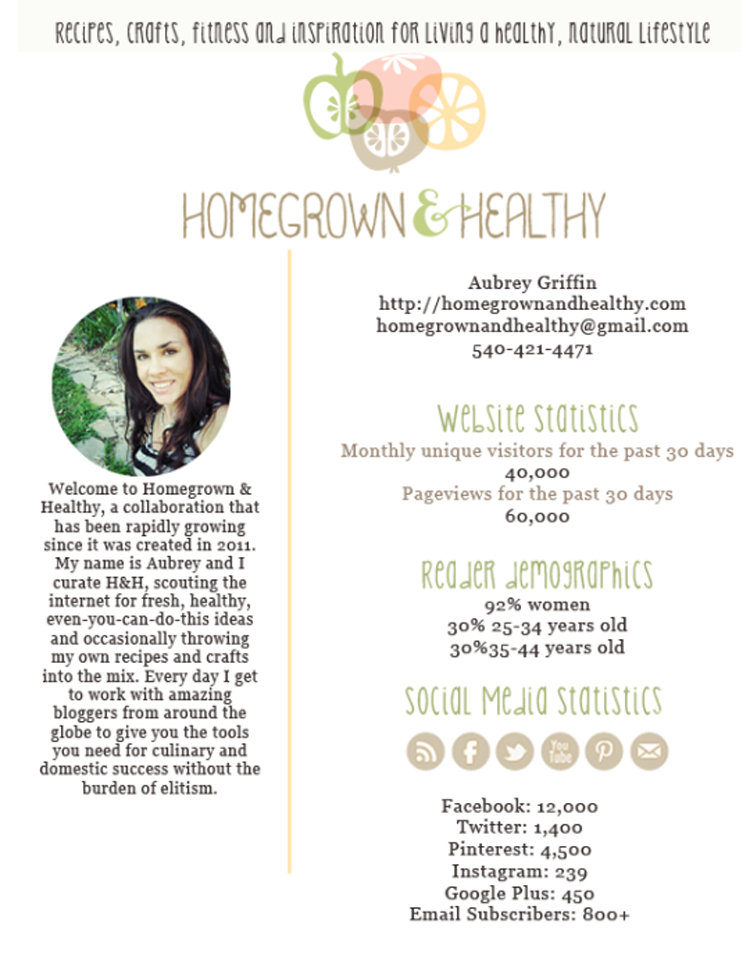
ReplyI just wanted to say how much I loved your layout and color scheme. It looks and feels “healthy & organic” which I thought was great!
ReplyPlease leave feedback for The Merrymaker Sisters here.
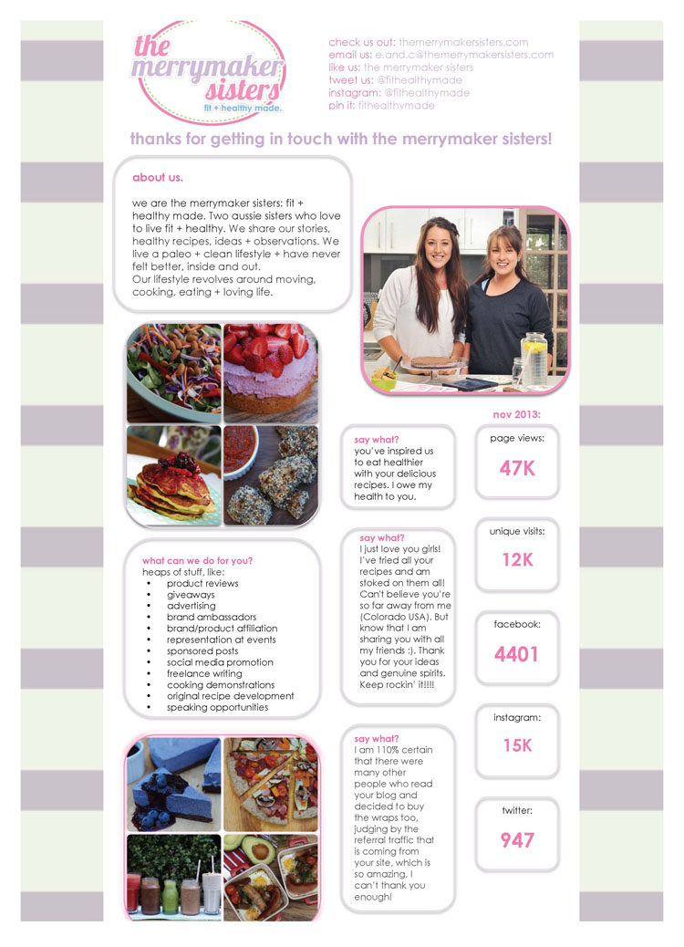
ReplyI really like this media kit! It has tons of cute personality but is not overwhelming (like mine–haha!) There are plenty of great photos to give a glimpse of what the blog is about without reading any words.
One thing I would suggest is to change the “say what?” heading to something like “others have said…” or “our readers say”. It took me a couple moments to figure out what those 3 little sections were all about.
Thank you so much Carrie! We totally agree, that’s a great idea! Make it more simple to understand 🙂 Thanks for taking the time to read our media kit 🙂
ReplyHi ladies! First off thank you for the sweet comments.We are new to the media kit/ sponsorship world and we loved getting feedback!
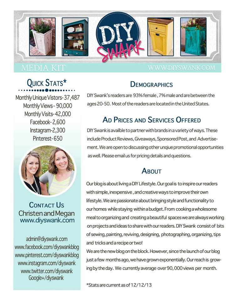
Your media kit is adorable. We love the layout and the feedback from your readers. Great idea! It’s clean and easy to read. The only feedback would be to make it easier to find you media kit on your site but you already stated that. Cheers! Christen and Megan
We are new to the media kit sponsorship world and we loved getting feedback!
ReplyHi Christen and Megan! Thanks so much for the feedback! We definitely agree about finding our media kit, we’re thinking of moving it to the ‘advertise’ tab – as this would probably be better placement than under the ‘about us’ tab. 🙂 🙂 Thanks again for taking the time to look at our media kit! e + c
ReplyLove this kit! I like the boxes around the info and the way the stats jump out at you. The photos are an asset as well. Nicely done!
ReplyYou have a great one page kit. It has nice testimonials, a warm and friendly picture, quick stats.
Since it is just one page, do you think you could have it embedded on your site directly? Quicker and easier to glance at!
ReplyThanks Teri! Great idea, we definitely need to do some work on the page it self! We are also thinking we will develop a larger kit. Lots of things to think about + work out! Thanks for taking the time to check out our kit. Emma + Carla
ReplyHey sister! I love your head shot, the colors you’ve used and how you’ve broken down both the opportunities and blog info with catchy headers. Generally speaking, it’s organized very well!
You do have a LOT of text though – I wonder if you could simplify a bit? Less words, make it look cleaner and easier to approach. Too many words can seem like a LOT to read – sponsors want to be able to scan your kit and know immediately if there’s a partnership opportunity or not. Just an idea 🙂 Looks great though!
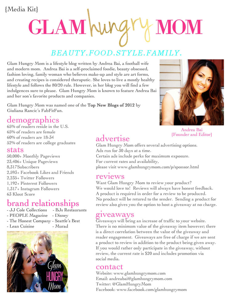
ReplyHi Andrea, your media kit looks great! You have all the relevant information presented in an easy-to-use format. Just one tiny detail – you definitely have a growing fan base on YouTube. Make sure you include that in your counts!
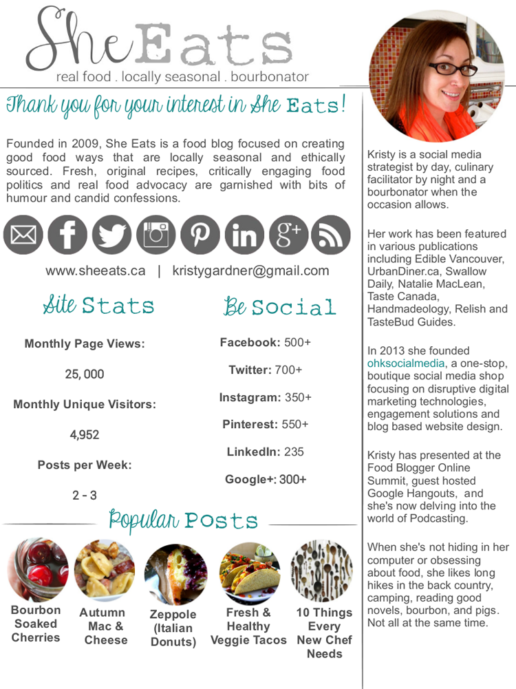
ReplyHi Kristy! Love love your blog and media kit design! Especially the look of that Classic NY cheesecake! It is really consistent and you’ve definitely set a brand/theme. One thing that really stood out for us was your personal description. It’s written really well and we felt like we knew you once we’d read it! This adds a personal touch to your blog and is really welcoming. You’ve also nailed the outline of what you can provide to companies/businesses. One thing we thought that wasn’t neccessary was the popular posts, unless these can directly link to those posts – though on the other hand these have great example images from your site! It might be good to include some testimonials from businesses and readers that have seen a positive impact from reading your blog or working with you. You could also include some more statistics like bounce rate and length of time spent on your blog. Also, if your engagement is high this might be something to include 🙂 Hope this helps!
ReplyHey sisters! 😉
Thank you so much for your feedback – very helpful! I’ll definitely add engagement rates and I’d love to include testimonials too as I have quite a few of those. Good ideas!! I just wanted to note too that the popular posts ARE linked on the actual media kit – just not as an image here. Thanks again – will try to work in the suggestions you’ve mentioned 🙂
Hi Kristy,
Impressive blog and Media Kit. I like that you’ve mentioned all your published articles and appearances on the page–you lured me in! I also enjoyed the line up of photographs on the side bar. My only suggestion is to include stats on the page–a short and simple list and perhaps pricing too.
I love how your media kit is so clean and easy to read. And I LOVE the photos you’ve included in your kit – it makes you seem real and accessible.
I love that you include what you’re all about – you make it plain what you blog about. You know your niche – that’s uncommon these days. 🙂
I would suggest that your pricing is a bit low. Honestly, your time is worth more than $10/month. Your blog and your word has a LOT of value.
Also, I noticed you’re only using Facebook and Pinterest for social media – you might consider adding Twitter or Instagram as another form of getting the word out about you and your blog.
Great job! 🙂
Thanks for your feedback, Stacy. I am most definitely going to raise my rates this year! Thanks for the encouragement.
ReplyI love the clean look and typography in your media kit. It seems to complement the topic of your blog. My suggestion would be to make your numbers more visible on the front page. Maybe I’m just lazy, but I would rather have all the information on 1-2 pages.
Overall, good kit, though.
Firstly, we love everything about your blog. It’s super cute + actually makes us want to get into DIY (we do the cooking part only so far!). Your media kit is set out clearly, it’s easy to understand + if we were an aligned business we’d want to work with you! From an outsiders perspective maybe you could add some testimonials from brands + businesses you have worked with. Sometimes it’s easier for other people to sell your service! Also you could have the link to the media kit a little more visible (something we need to do too!). Love your advertising method of selling, clear + simple again (looks like Passionfruit, we just signed up). Thanks for sharing your media kit with us all. Emma + Carla.
ReplyI like the detailed description of the blog’s main audience–this will make it easier for advertisers to know exactly who will be seeing their advertisements. I love how clean cut and to the point this media kit is. All the information needed is easily accessed quickly.
ReplyHi Christen, thanks again for sharing your media kit with us. I have one idea to help you make a bigger splash with your media kit: I’d like to find out more about your most popular posts. Ideally, you could provide thumbnail images from the post with the post title, and then share a bit about the reach of that post. How many pins did that post get? How many FB shares/tweets/comments? Potential brand sponsors are going to be comparing your blog with others, based mostly on your media kit. Make sure you’re conveying what makes your blog unique. Best of luck with your new sponsorship opportunities this year!
ReplyHey Carrie! Great media kit! It pops with it’s super fun and bright colors and layout. I love the ribbons and fonts as well as the images that you use. It’s super easy to scan what you’re all about and get the info I need to know if our brands would be a good fit.
I suggest moving (or duplicating) your contact info to the front page. You never know if someone is going to print that off and if they don’t see it on the front because they’re lazy (or they lose the back page), you could miss a potential opportunity. Otherwise, it’s awesome!
ReplyThank you so much for the input Kristy!I know I’ll be making a lot of changes to my media kit and it’s so helpful to know where to start!
I agree putting the contact info on the front page is a great idea!
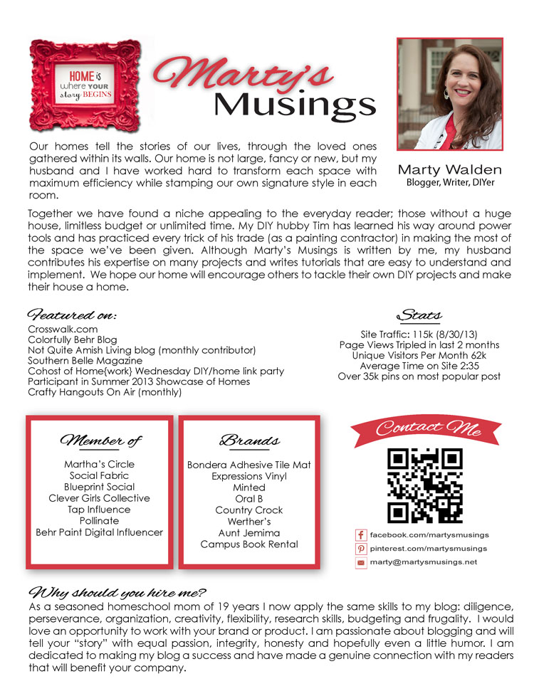
Hey Marty! I love how you break up your media kit with headings and the contact info is easy to see – especially with that fancy pants scan thingy! I need one of those!! I also love how your headshot is right up front too. Very nice! I might suggest that you swap out the “Why you should hire me” section for popular posts, more images, other info that might be relevant. All the “why you should hire me” stuff should really be in the first couple paragraphs at the top – sell you and your blog together there and you’ll have more room to give examples as to WHY they should. Show AND tell 🙂
ReplyThanks for the advice! I have to redo the kit for Snap anyway so I’m sure I”ll look at the layout and what I’ve included and where.
ReplyOh I love EVERYTHING about your media kit!!!! From the fonts to the colors to the breakdown about the blog to images to your head shot and audience info – it’s awesome. YOU’RE awesome 🙂 The only thing I can see that’s lacking is maybe some info as to the partnership opportunities you offer or are willing to do. Add those and you’ll be golden 🙂
ReplyThanks so much Kristy, glad you liked it! I agree, I’m still uncovering some of the partnership stuff as I go, the other kits around here will be great inspiration for me. Thanks for checking mine out 🙂
ReplyI really enjoyed your media kit. You have great photos, nice examples of how you’ll highlight sponsors or partners, and your statistics are really well presented. It all looks very professional and warm and inviting.
The only page I would change, is your testimonials. I felt that the comments focused more on your sense of humor (which is awesome to have, of course), and less on your blog/content. Could you add a few more of the “you inspire me to eat better” variety?
Beautiful family photos too!
All the best,
Teri
Great ideas, I added those user comments a while back and always tried to communicate the funny aspect of my blog but as my blog evolves and becomes more helpful, and less overtly funny, the comments should communicate that.
ReplyHi Jessica, thanks again for sending your media kit for inclusion in this roundup. I love the colors and consistent branding of your media kit – the only thing I’d be concerned about is its length. It might be helpful to have a “long form” that includes everything, and a shorter 1-2 page kit for an at-a-glance snapshot of your blog. As an example, the excerpts of your blog posts, while a nice touch, could be condensed to a title, photo, and relevant statistics of engagement on those posts: if it’s really a successful post, you could have pageviews, Facebook shares, Pinterest shares, comments, etc. and link it to the article directly on your blog if the brand rep wants to see an excerpt. I think that will give better quality information than just an excerpt of the post itself.
Again, I appreciate your generosity in sharing your media kit here and wish you the best of luck in your sponsorships!
ReplyHey Jeni, great ideas and super easy to implement so I’ll definitely get started on those. I had a really successful campaign with Old Navy over the holidays and it would would make sense to include that data in the media kit. Thanks again for featuring my kit, lovely to get some smart feedback from your audience.
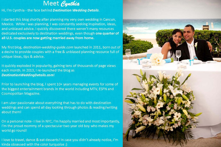
ReplyPlease leave feedback for Destination Wedding Details here.
ReplyThe picture is beautiful and conveys what you’re trying to sell. The blue was a little bit hard for me to read with the white print. Possibly break it up with boxes or consider a different background? I’m a bit older (51) so I find it harder to reader smaller print and colored backgrounds. Maybe a consideration? Great job, though!
ReplyI really love the color scheme. It makes me think of a fun, tropical vacation. However, I would change the light wording on the dark background. You want it to be easier on the eyes and something that can be printed.
ReplyThanks for the great feedback! Every other page of the media kit has dark text on a white background, and I just thought I would add a little splash of color to the “about me” slide – but you’re right about the color. I need to find a better color combo.
My biggest struggle is finding a way to condense all the info and make the overall media kit shorter, while still communicating the benefits. Reading through everyone’s media kits has been so inspiring. I have a lot of work to do to revamp mine:)
Thanks so much for the feedback & please keep them coming:)
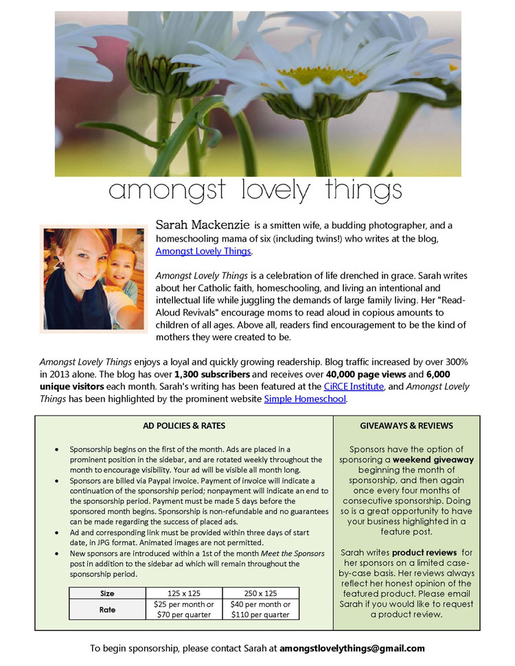
ReplyPlease leave feedback for Amongst Lovely Things here.
ReplyI just can’t wipe the grin off my face that you are a “smitten wife.” That is just AWESOME! 🙂 Too much husband bashing these days. Good for you!
It’s a fantastic idea to note where you’ve been featured as a blogger/writer. Growing 300% in a year?! That’s ROCKIN’!!!!
I like that you have your policies up front and center. No wondering.
I would suggest that you mention if your reviews/giveaways are free or if you charge. And if you’re not charging, YOU SHOULD. 🙂
Great job!
I love how clean cut this media kit is! It’s simple and to the point. Any potential advertiser will find out the information they need quickly. The statistics of followers are great and really give the audience an idea of how many people they might potentially reach through this blog.
I would recommend adding a couple personal photos and maybe some photos from posts to give the potential customer more of an idea of what the blog is all about.
All in all this is a great media kit!
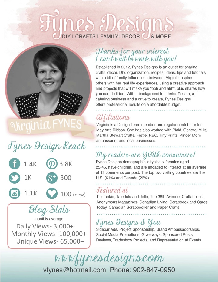
WOW! What a line up of Media Kits! They all have great qualities, but I think I prefer the kits with a bit of visual interest. I like when stats are easily recognizable and I can right away see what your blog is about without having to hunt through text. I’m not one to talk, I have a lot of reading on mine (Fynes Designs)… now that I see others media kits, I really like how Metropolitan Organizing, She Eats, Merry Maker Sisters are very visual, and you can skim the information in a very few seconds.
ReplyJeni! This is so well done!!! Thank you for including me in your collection – I’ll be looking at, reviewing and participating with some of the other blogger’s media kits as well. Love it! You. are. awesome.
ReplyThis post is giving me a lot of inspiration to re-work my media kit! Even as I sent it to you I knew it needed a lot of work. Now I have lots of inspiration and great ideas to work with. I’m looking forward to getting some great suggestions from fellow bloggers and you, Jeni!
ReplyLOVE LOVE reading all the feedback from everyone! This is such a supportive environment and we have really gained a lot of knowledge of what others are doing with their media kits. Thanks Jeni for putting this together, we should do this more often 🙂 🙂
ReplyI really love this post! So many beautiful media kits.
I also had no idea how important a media kit was, after seeing all of these, I’ll be adding it to my “to do” list.
My personal favorites tend to be those that are big on pictures and small on text. I like being able to look at something and quickly get the necessary information before moving on. It’s hard to do that when you have to read long paragraphs of text. Just my .02!
ReplyThis is a great collection! I really do feel inspired to get on and make my own, now 🙂
I particularly love the kits with a more graphical focus: the ones that look like a web page snapshot, rather than a letter, and feature logos and icons. I know that’s personal taste, but it feels like they stand out and give a good feel for the style of the blog if the kit is consistent with the blog’s branding. I would be keen to work with someone who shows that kind of attention to detail, even if their numbers were smaller.
ReplyHi Huong, as far as growing a social following, I don’t think there’s anything better than participating in online events, like Google Hangouts on Air or Twitter chats. Just getting to know people online, whether it’s in their space or yours, helps grow your following. As far as gaining attention from brand sponsors, there’s nothing as effective as going to blogging conferences and actually meeting brand reps in person. That’s where it’s handy to have a nicely done media kit so you can show off your best side. 🙂 Hope this helps!
ReplyHi Jen!
Great post! I enjoyed perusing these examples!
I previously used a professionally-designed kit that people could download, but my marketing manager found that she was more often just pasteing in my stats to cold call emails to our sponsors.
We recently decided to ditch the official “kit” and use a Mad Mimi newsletter template that makes it super easy to update stats, update what’s sold/unsold and tweak for individual pitches, etc.
My marketing manager has told me that in her experience small business owners are super busy and don’t have time to do anything but skim emails that come in.
ReplyHi Erin, thanks for your note! I *love* your idea of having an email template set up and ready to plug your stats into – it definitely helps with the happy medium between a formal press kit and a plain-text email. Super smart!
ReplyI liked #1 and #9 best as I feel they are the most professional looking and easy to see social media stats and well as being clean and easy to read.
bonus (lol) – What elements from these media kits make them truly stand out to you? Think about this as a potential brand/sponsor. What is the #1 thing (besides statistics) that would convince you to work with a blogger, based on their media kit?
My answer – clean, easy to read presentation – stats easy to find – clear picture but no clutter. simple, easy to understand “about me” written in professional manner in third person. (only my opinion)
ReplyHi Jeni!
I am a pet blogger who has been looking to expand opportunities on my blog. My “Pixel Blue Eyes, Her Tails of Adventure” blog is written from my dog’s perspective and has a faithful following. We’ve worked with a few companies and wish to make our marketability grow. Thank you so much for the examples of media kits. The differences are so vast, but I found several elements I really liked that gave me ideas for my own media kit. I especially liked the ones that had clearly defined “sections” that made it easy to see things like stats at a glance, meet the author, etc.
Have a great day!
Jenny & Pixel
http://www.pixelblueeyes.com/2014/01/TwistFatePixelWordlessWednesday.html
http://www.pixelblueeyes.com/2014/02/the-joy-of-positive-pet-training-how.html
Wow, this is literally exactly what I have been looking for. I’ve been blogging for 4 years and within the last year and a half the amount of requests and emails I’ve been getting from PR companies have exploded so I’m researching how to start selling space as opposed to just giving it away! The only thing i’m still in the dark on is contracts… do most of you use them?
ReplyI like so many of these but how have they been created? For example #13, She Eats? I don’t know how to go about it. Are there any templates out there? tips? Thanks for an amazing site!!
ReplyHi Angela, somehow I missed your comment when you initially posted it, but I wanted to make sure you got a response. The really beautiful media kits you see here are mostly done by designers. There are designers who will create them for $100 and some who charge much more, but the basic idea is to get a professional look that you can update yourself easily…so the investment pays for itself over time. I appreciate you taking the time to leave a comment!
ReplyThank you! I actually created one last week. Would you mind if I sent you a copy to get a quick opinion? If not, I completely understated!
ReplyWow, these are first-rate! Exactly what I needed to SEE. I’m ready to monetize my 8- month old blog after some trial and error. This has given me tools, courage, and focus to do it right. And, yes, I am definitely following you to get more advice and guidance.
All the best!
Jennifer Houghton
I too like the statistics paired with a icon. They all have some beautiful elements. Thank you for sharing.
ReplyGreat post!! Thanks for the visuals, that always is a big help to myself! Sharing 🙂
ReplySo many great tips and examples here! I currently use a one-page media kit. When I get ready to update it, I’ll definitely use some of these suggestions.
ReplyThank you so much for this comprehensive list of examples. I don’t have the numbers that many of the examples have here but I do feel the need to go on & put together my media kit anyway. I am learning that a lot of companies want to see you engaged with your followers even if you don’t yet have a ton. I appreciate posts like this because it shows exactly what to add & I really love the creativity expressed in some of them too.
ReplyOh wow, so many brilliant examples! I don’t even know which one’s my favourite. The Merrymaker Sisters and Fynes Designs both look amazing!
ReplyI agree, Ashley – those two definitely shine. 🙂 Good luck with making yours!
ReplyThank you so much for the free Media Kit tutorial and for posting these examples. I recently had my blog updated and requested recommendations for my PR section. This inspired me to put the work into an updated Media Kit and I’m very excited about the finished product, which I can easily update. You can find it here: http://theinquisitivemom.com/contact-me/media-kit
ReplyWow what a great selection thanks so much for sharing!! My blog is brand new so I have under 200 followers on each of my platform and less than 100 blog subscribers. With my current stats I can’t really advertise them to a brand but I see that one of your readers have not included stats in hers either only her target audience. Is this practice OK?
ReplyI think it’s fine not to include specific stats in your media kit, but it’s also important to be honest about them when the brand does ask. If you don’t feel like you bring that much to the table yet, you might just consider putting off working with brands until you have a bit higher stats to show.
ReplyThis is indeed an impressive collection! I’m a new blogger and would love to reach one day where these ladies have. I’m definitely book-marking this for future reference!
You think I got potential? What areas do you think I can improve upon? I’d love to know yours and your readers’ thoughts – http://www.sliceofdubai.com
I never heard of a media kit before LOL! I have been in this kind of business but never have I been asked for a media kit until yesterday. So this is what a media kit is. hehe Thanks for sharing Jeni, I’ll try to make one later.
ReplyI’ve been putting off on working on my media kit, it’s about time. Thanks for the inspiration. Also pinning this!
ReplyGreat list of example kits! I was immediately drawn to #1 and #2. Geralin’s is professional and sharp and I love how she included her target market! Also her headshot looks very professional but is still genuine and personable! Well Done Geralin!
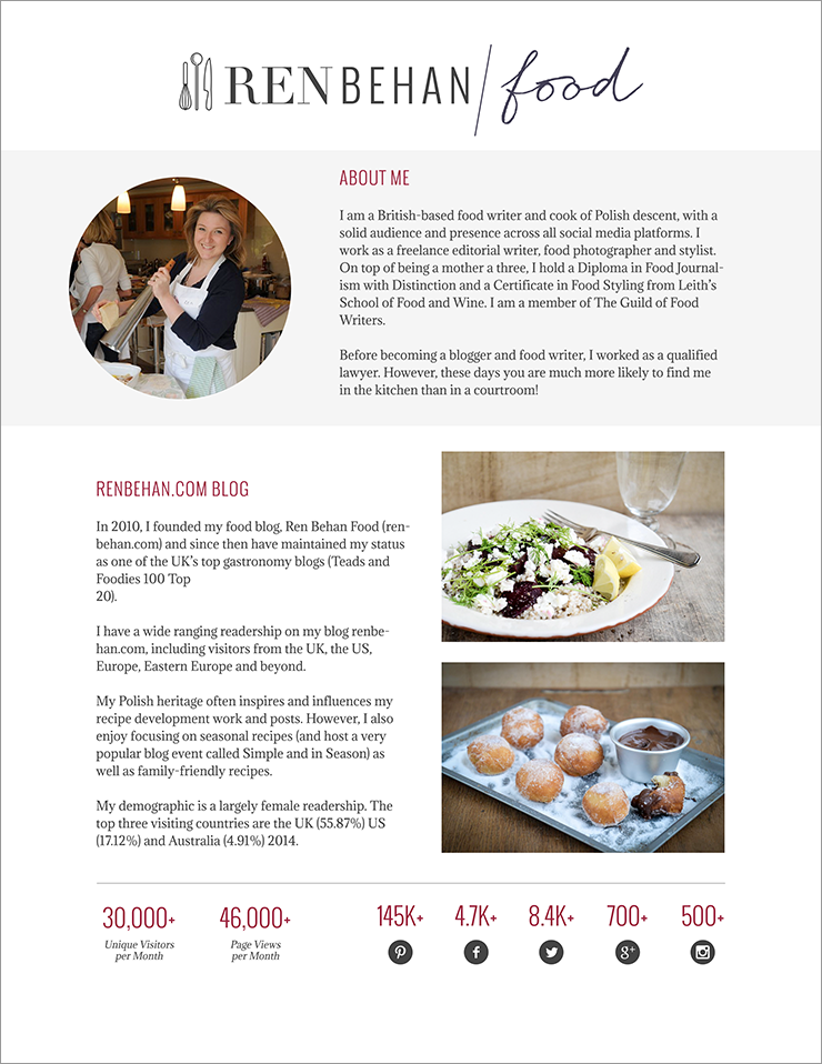
I also loved the minimalistic style of #2 and the photos are wonderfully styled to match that minimalistic feel!
ReplyThese media kits are beautiful and extremely informative. Thanks for the exceptional collection. Great help for me to start making one for my website.
Thanks!
Aarshi
http://www.trailsunraveled.com
Hi,
The work you guys do ia truly amazing. My main focus on going into this is to inspire, motivate and let people know that no matter where ypu come from that upu can do it. I also have a passion for Kids and i feel its my duty to equip them with the know how of challenges they may face and simple ways of facing them and coming out stronger and wiser. I want to make kids know and believe that they are destined for greatness. I haven’t had the easiest life but through my experiences i am able share, mold and have them understand the importance of education and how it will benefit them to be great leaders some day. Kids are our future and its our duty to Love them, Nurture them and instill great values in them. Parents need to ensure that they play a very vital and important role in all that i have said above. As adults even if i dont have kids and i see or witness a kid misbehaving or doing something out of Character. All of us as adults should at least have the ability and patience to council and make that kid feel not just good but amazing. All kids should have the right to go to school. Teachers are Love, parents, doctors etc. Teaching is an amazing job and i am happy to have been able to Teach because the kids i Teach…..” I Love Them All” When i am with them all i ever want is for them to be someone and be proud of who they are.
I’m certain this post has inspired and helped spur a lot of bloggers to prepare their media kit. I’m also attracted to the graphical ones, though I tend to write more…. And I really have learned a lot too from the comments written here. Thank you very much for taking the effort to share this. 😀
ReplyExcellent post and excellent comments. The ideal MK is to keep it as short as it needs to be but not looking “crowded”. The concept of creating such starts by first researching how recipients listen and read. That is the key. A Media Kit is not about what you like but how others understand information.
ReplyJen. Great read! Where can I find a Media Kit Template that I can just add my information to? Or would you suggest designing my own.
ReplyHi Jacqui, I actually teamed up with a fellow designer awhile back and we developed a template for Photoshop…that also teaches you how to use Photoshop in the process to customize your kit. You can check it out here: The Brand Magnet Media Kit Template
ReplyJeni, this is very interesting and a great jumping off point for my media kit. But I’m a guy and a Dad Blogger http://thedadblogger.co.uk. Do you have any examples that would be more appropriate for my blog? Sorry if this has already been covered, I’ve haven’t read all the comments. 😮 Sorry!
ReplyEither way, Grace – it’s your choice. My preference would be to tell the companies how to get your media kit (by emailing you), so you’d have a record of who is viewing your media kit. That way they’re opening up a conversation with you, not just grabbing your media kit and vanishing. Cheering you on!
ReplyThank you so much for this! I have been struggling and have not found a straight forward answer to many questions I had. You’ve answered my questions (even ones I had not thought to ask)
ReplyTHANK YOU for this article. I had a question though – How do we write about stats that change constantly. for example if I write a travel article and a link to that on my social media, I get a lot more daily visitors than when I write about a cooking/fashion article. How do I mention my daily page views on my media kit then? And also, A media kit must regularly be updated? How regularly? Thanks in advance! Would go through more of your informative posts which act as a guidance for new bloggers.
Reply
 Hands down, one of my most helpful articles for bloggers who want to connect with brands is