
Module 4: Convert & Conquer
Open More Gateways
Note: Because this lesson is more like a tutorial on which tools you can use to open more gateways, it’s in a written format. That way, you can easily refer back to any sections you need to later on as you implement changes on your own site.
At this point in the program, you’ve had lots of practice with seeing the visuals and the words on your site through the perspective of your target market. When you put on your Target Market Goggles, you understand what your reader needs to see in order to know, like, and trust you.
And that’s essential if you want to build a strong brand.
In the last lesson, you learned that the actual tool you use to get your reader to subscribe—whether you’re using a slide-in, a pop-up, a landing page, or just a regular subscribe widget in your sidebar—isn’t anywhere as important as the messaging you’re using to tell your reader WHY they should subscribe.
That’s because your reader comes to your site with her guard up. Her level of suspicion is high. Your messaging must systematically remove the red flags in her mind about subscribing so that she can connect on an emotional level and a logical level with you. Only then will she follow through and subscribe.
To be clear, growing your email list could easily turn into an entire course itself, so let’s boil this topic down to the most important techniques you can use today – the things that will give you the biggest, quickest wins. In this lesson, we’ll cover two topics: first, how many subscriber gateways you need, and second, which ones you should use on your site.
What’s the “Right” Number of Gateways?
How many subscriber gateways do you actually need on your site?
Most bloggers have just one in their sidebar and leave it at that. But the truth is that those blogs typically aren’t converting their traffic to subscribers at a high rate.
In fact, you’ll get the best results when you open a gateway in several locations on your site.
Here’s why: Your website may seem like a small place, but as soon as your reader scrolls just a tiny bit down the page, what they’re seeing is completely different from what they saw before they scrolled. In other words, the gateway they saw at first may have entirely disappeared, and they may not even understand how to get back to it.
Also, depending on where they are in your site – whether they’re at the very top because they just arrived, or whether they’re at the end of a super helpful piece of content they just finished reading, their state of mind – what’s actually going through their head – is completely different.
So in this lesson, we’ll walk through your site step-by-step (with your Target Market Goggles on!) to see what your reader is thinking. And that will reveal to us what we should show them – which type of subscriber gateway – in order to capture their attention, right where they are.
But First, a Warning…
You don’t have to do everything in this lesson. In other words, out of all the choices we’ll cover, you certainly don’t have to add every single tool we discuss to your site. You’ll need to use the information in this lesson to make a CEO decision for your business. Because there is no “wrong” or “right” choice — only what you do and what you learn from it.
Just because one type of subscriber gateway is available, that doesn’t mean you absolutely have to use it. But keep in mind that the more gateways you can open, the more visitors you can convert into subscribers. As a rule of thumb for the purposes of this program, try using at least three different types of gateways on your site. Then later on after you see the impact on your conversion rate, you can always adjust the number of gateways.
But if that feels a little overwhelming, remember that you don’t have to implement everything all at once. Just take it step by step. And as a reminder from earlier in this module: If you’re not yet comfortable with using your email marketing tool, you might want to consider hiring a tech person who can help you with implementing what we cover in this lesson.
Area 1: Top of Page
Remember this from module 3? When the reader first lands on your site, their brain spends the first three seconds trying to figure out the answer to these two questions:
- “Where am I?” and
- “Am I in the right place?”
If you want your reader to see you as an authority in those first three seconds and to view your website as a resource that can help her, then it helps to show her what you have to offer right from the start.
That’s why subscriber gateways in the header of your site are useful.
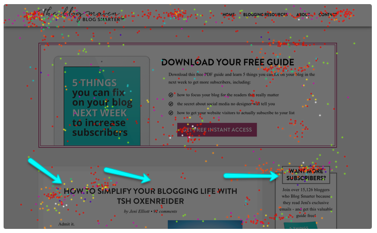
For example, take a look at the results of an eye tracking study done on the Biz Mavens site a few years ago. This study tracked where people’s eyes go from the moment they land on the page. Each colored dot represents where readers’ eyes landed.
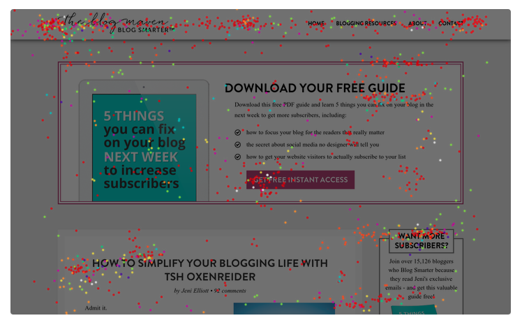
You’ll see that their eyes start at the top left, where they encounter the logo and they probably think, “Okay, I’m on a site about blogging.”
Then they scan to the right and see what’s in the navigation. “Blogging Resources” is an important clue to have there because it reinforces what the site is about.
Then even before they make it down to the content they came for in the first place, they scan down and see “Free Guide” inside a box. That area is called a Feature Box.
Gateway Tool 1: Feature Box
The reader hasn’t even started reading the post itself, and yet their brain already has a clear picture of what this site is about, and whether it’s a place they belong. What they’ve encountered at the top of the page doesn’t leave anything to the reader’s imagination. In those crucial first three seconds, all the signals communicate that if you’re a blogger, and if you want more subscribers, this is the place for you.
At the end of this lesson, you’ll find recommendations on specific software tools you can use to implement each subscriber gateway. For now, focus on the pros and cons of each gateway so you can make the best CEO decision for what to add to your site.
Feature Box: Pros
- Can help you connect with readers on a level of value right at the very top of the page
- Typically can be configured to show up on key pages like your Home page or on every single page of your site – so no matter which post your reader comes in through, they see the value you’re offering right away
- Reinforces your strong brand because you present yourself as someone who has solutions
- Compared to other gateway tools, gives you more real estate (for words + an image) to attract your reader’s attention and explain whatever you need to explain to help them see why they should subscribe
Feature Box: Cons
- On WordPress, you’ll need a theme that already has Feature Box functionality included, or use a plugin and do it yourself — but that can result in a less professional-looking Feature Box — or find a designer or developer who can code it into your site for you.
- Anytime you embed a form directly into your site, you open the door to spam bots that can attack that form with hundreds (or thousands!) of bogus email addresses. Look for a gateway tool that will protect you from this such as with Captcha validation (the simple checkbox style), or try the “Lead Box” gateway type instead (see below).
While the Feature Box is one of the most effective types of gateways, it can also be one of the hardest to actually implement on your site and do it well, depending on your site design or theme.
Gateway Tool 2: Hello Bar
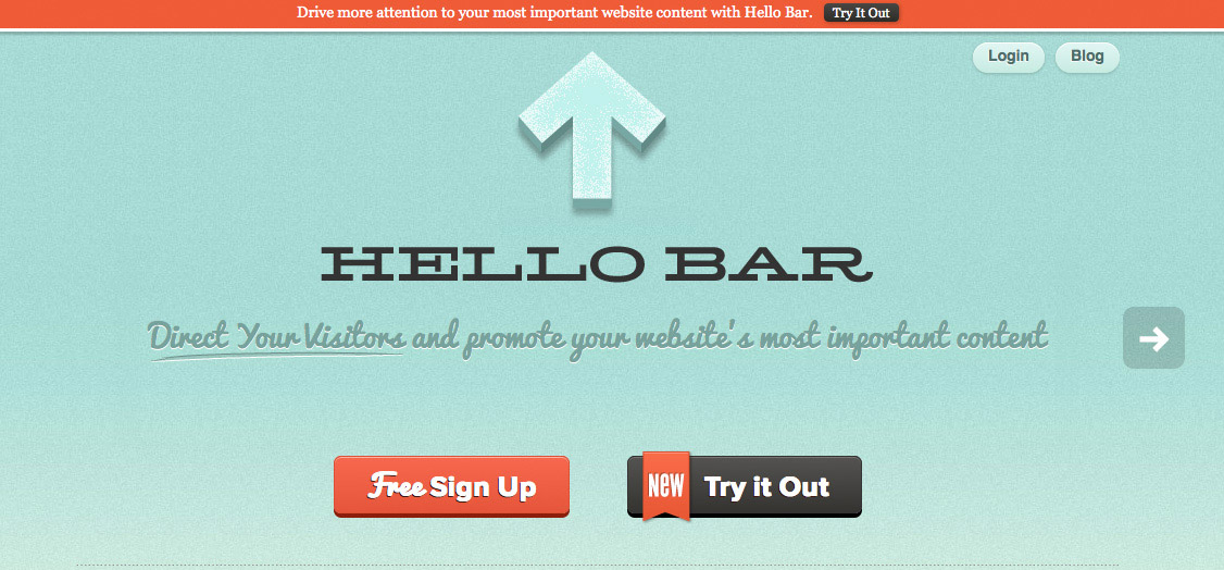
Another type of subscriber gateway that works well when your reader first arrives on your site is a Hello Bar.
This is a little bar that appears at the top of the screen — or sometimes at the bottom of the screen. The Hello Bar is just tall enough for a short and simple message asking the reader to subscribe.
Hello Bar: Pros
- You can install it yourself
- It’s easy to customize, so you can change the words easily, and you can also change the colors easily to help the bar stand out so your reader will notice it
Hello Bar: Cons
- You have only a tiny amount of space – so whatever you’re going to say, you have to make it super short while still being compelling
- The placement of the Hello Bar can interfere with ad placement, if your site is monetized with ads
- The Hello Bar is now widely used, so it may be less noticeable to readers because they’ve learned to “tune out” whatever shows up in that spot on a website
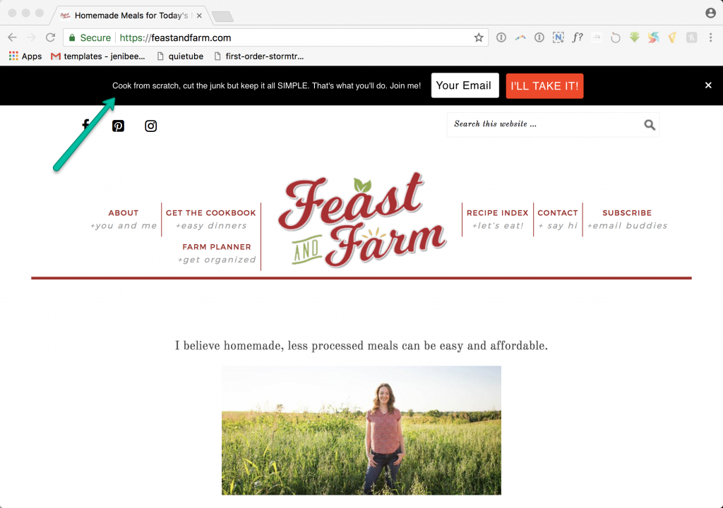
Here’s a quick example from a Blog Smarter grad. (Check out the strong brand messaging!)
Gateway Tool 3: Header Subscribe Box
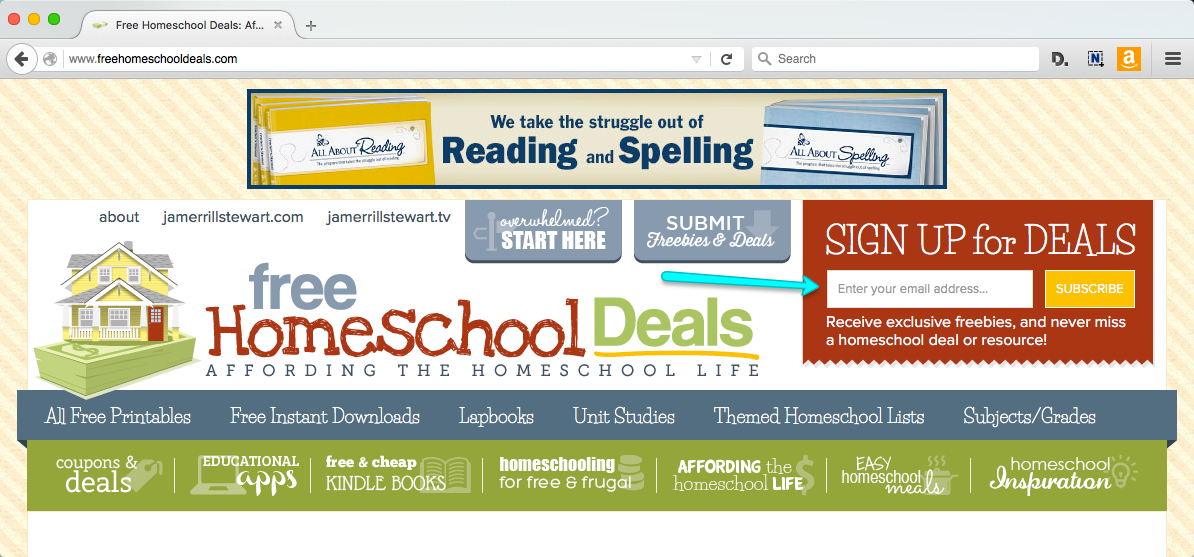
In the header of a site, sometimes you’ll see a subscribe box, as shown in the following example. This site has a lot going on, but on the right side in red, you’ll see a subscribe box.
Header Subscribe Box: Pros
- Typically shows up on every single page of your site
Header Subscribe Box: Cons
- It’s a small space, so you don’t have a lot of real estate to work with
- If you already have a lot going on in your header area, the subscribe box can add to the “noise” and overwhelm the reader visually
- You either need to find a theme that already has one, or you have to hire a designer or developer who can code one into your site for you
- Anytime you embed a form directly into your site, you open the door to spam bots (see the Feature Box: Cons section for more information)
Area 2: Content/Middle of Site
After the top of the page, your reader scrolls down the page and engages with your content.
The first thing she reads is the headline. And then because we read left-to-right, her eye naturally sweeps over to the right side of the page to discover your sidebar.
Gateway Tool 4: Sidebar Subscribe Box
Your sidebar can be an effective place for a subscriber gateway, but it has to do two things:
- The subscribe box has to stand out because readers naturally suffer from a sort of “sidebar blindness.” If your sidebar subscribe area blends in with everything else in the sidebar, then your reader will skip right over it.
- If you bury the gateway as the second or third item down on your sidebar, your reader likely won’t see it at all. That initial eye sweep your reader does as she reads the title extends only to the side of the page a handful of times. If you’re prioritizing growing your list, give your sidebar gateway the most important spot, right at the very top.
Sidebar Subscribe Box: Pros
- On WordPress, many themes include widgets for your sidebar and include a subscribe box by default; otherwise, several different plugins give you the option of adding a subscriber gateway to your sidebar
- The reader’s eyes naturally sweep from the post title to the sidebar on the right; if your sidebar is on the left, her eyes will typically land there first and then move to the post title, so this gateway works with either sidebar placement
Sidebar Subscribe Box: Cons
- Readers suffer from “sidebar blindness,” so your subscribe box must stand out
- Subscribe boxes that show up lower in the sidebar aren’t as effective
- Readers on mobile typically don’t see sidebars until the very end of the post, so this gateway captures primarily desktop readers
- Anytime you embed a form directly into your site, you open the door to spam bots (see the Feature Box: Cons section for more information)
Continuing on with your reader’s experience, at this point your reader is likely to start reading your blog post.
Let’s say she truly connects with it. She may even think, “Wow, this is awesome!”
But in the middle of your content, you’re in a tough spot. Because the reader already left the top area of the site, and she already scrolled down past the top of the sidebar. There’s nothing to see here – no way for your reader to subscribe, even while she’s totally loving what she’s reading. And this is where some more advanced kinds of subscriber gateways come into play.
Gateway Tool 5: Pop-Ups, Slide-Ins, And More
Ah, the pop-up. The thing people love to hate and hate to love!
Yes, pop-ups can be annoying.
Yes, they interrupt what your reader was doing.
But the fact is…statistically, they really do work.
A pop-up helps you make the most of that moment when your reader is completely in love with you because your content is so helpful and makes her feel SEEN, HEARD, and UNDERSTOOD. The pop-up makes it possible for you to offer your reader something even more amazing they’ll love too – your Tiny Taste lead magnet.
How to Make Pop-Ups Work for You (And the Reader)
For pop-ups to be effective, you need to avoid a couple common pitfalls.
First, suppose you show the reader a pop-up the very second she arrives on your site, and the pop-up hides the text right at the exact moment when her brain was trying to figure out where she is, and whether she’s in the right place. That’s annoying at best, and your reader may even leave your site immediately because of it.
Instead of showing a pop-up right when the reader lands on your site, set up a delay before your pop-up appears. That gives your reader time to get a little further down the page and fall in love with your content, and then you can show her something that will be even more helpful. For example, you can:
- Set the pop-up to appear after your reader scrolls a certain percentage of the way through the post. Or if that’s not possible, you can set a delay timer so the pop-up appears after a certain number of seconds.
- Set up an “exit intent” pop-up, which shows the pop-up offer only when your reader’s mouse goes back to the top of the screen because they’re getting ready to leave your site anyway. Some research shows that a well-crafted exit intent pop-up can convert 10 to 15 percent of people who otherwise would have just left your site forever.
Delaying the pop-up is a little like this: Suppose you’re in a store and having a great experience there, and as you approach the door, someone calls out to you, “Wait! I want to give you this special gift that will help you because we really value you.”
Second, many pop-ups have weak messaging. For example, check out the pop-up messaging shown below.
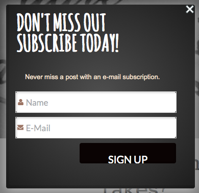
Every subscriber gateway must make it clear what’s in it for your reader to subscribe, and pop-ups are no exception.
Area 3: Bottom of Site
Suppose your reader makes it all the way to the bottom of your content, she finishes the very last word of your post, and…
Now what?
She can leave a comment, but what if she isn’t interested in that?
She’ll probably just move her mouse back to the top of the page and leave your site—unless you catch her eye in that moment and invite her to subscribe.
Gateway Tool 6: End of Post Subscribe Box + Author Profile
The “end of post” subscriber gateway gives you the opportunity to engage readers who are already connecting with your content so you can invite them to subscribe.
With the plugins available today, this box is easy to create so it’s a must have. Here’s an example from the Biz Mavens site.
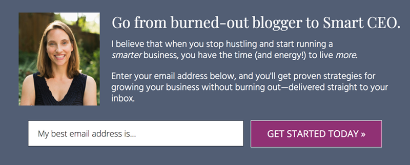
If you don’t want a full-blown subscribe box at the end of your posts, an alternative gateway opportunity you can leverage is your author profile. Just put your Target Market Goggles on and rework the text of your author profile to align with your subscriber gateway messaging.
Also, keep in mind that anytime you embed a form directly into your site, you open the door to spam bots (see the Feature Box: Cons section for more information).
Gateway Tool 7: Footer Subscribe Box
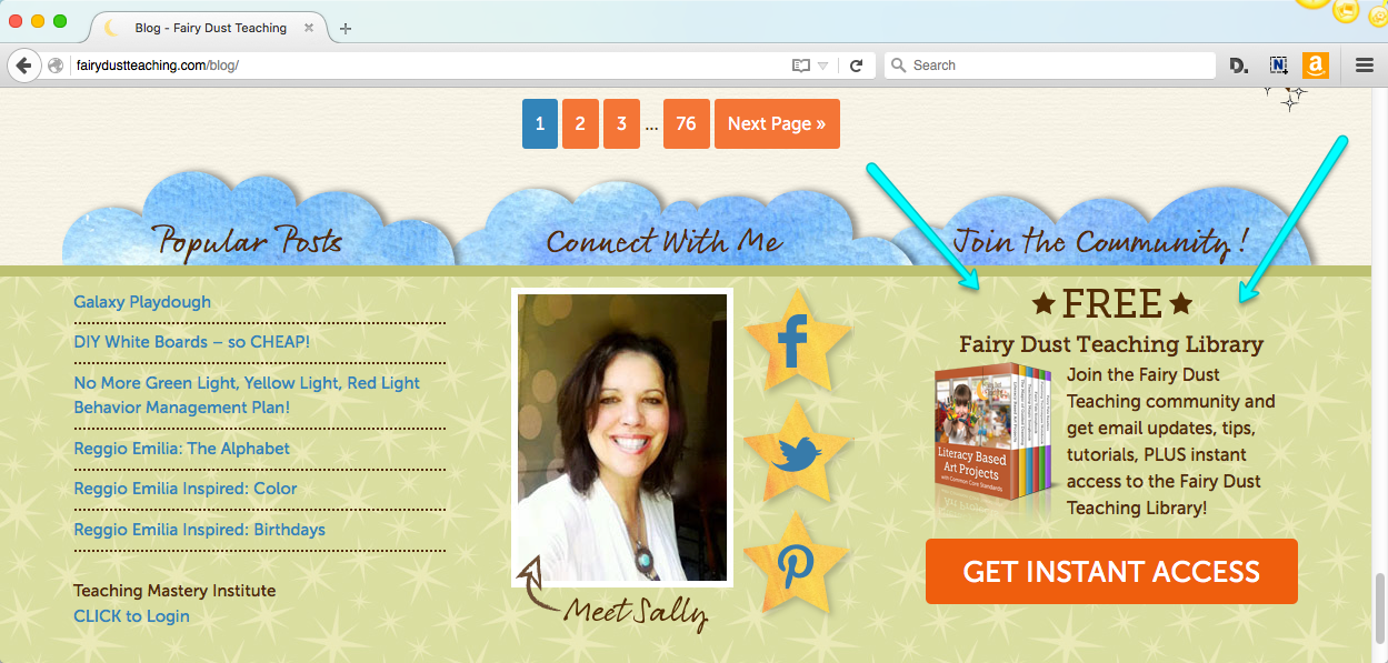
You can also add a subscribe box to the footer area of your site.
Footer Subscribe Box: Pros
- This gateway doesn’t interrupt the reader’s flow of reading your post
- Many themes include subscribe box widgets you can add to your footer
Footer Subscribe Box: Cons
- At this point, your reader has been through every part of your page, so in their mind, they’re wrapping things up—which means you’ll need to catch their attention with a bright color, a gorgeous image, or a large size, or find another way to stand out
- Anytime you embed a form directly into your site, you open the door to spam bots (see the Feature Box: Cons section for more information)
Advanced Gateway Tools
A couple more gateway tools I want to mention can be incredibly effective in converting visitors to subscribers, but they do require an investment in a premium-level tool. (I personally use both of these options myself.)
Gateway Tool 8: Lead Box or Lightbox
For this gateway type, the reader clicks a text link or button, which then displays a pop-up window where the reader can enter her email address. This style of gateway is called a Lead Box. Here’s a demonstration of what it looks like in action on a site.
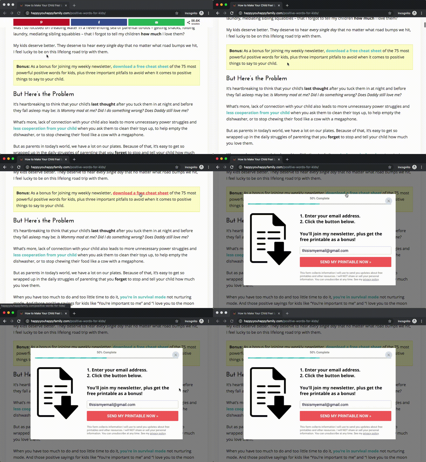
At first, this looks like a normal text link, which you might think would be too boring to be effective.
But here’s why it works so well: Many readers have developed “banner blindness” online, meaning that when something looks like a polished advertisement, their eyes skip right over it. Some of the gateway tools we’ve covered so far can look like ads to the reader, so she may not even register the gateway is there. A text link lowers that red flag in the reader’s mind so that she actually sees the gateway.
Some research shows that the Lead Box style gateway converts 30 percent more people compared to an embedded subscribe box that appears directly in your post.
And here’s one more benefit for the Lead Box style gateway: Whereas Feature Boxes and other types of subscribe boxes typically show up on every page of your site, a Lead Box allows you to customize which offer to show the reader depending on which page she’s on. If you have different lead magnets, this is especially helpful. Lead magnets that are related directly to the topic of the post tend to convert at a higher rate than a more general lead magnet that’s the same across the whole site—and Lead Boxes allow you to take advantage of that.
For example, suppose you have a food blog for quick and easy dinners with a lead magnet that’s a monthly meal plan for quick dinners. But let’s say the reader lands on a post about quick desserts you can make for a party. The reader may not be interested in that lead magnet of a dinner meal plan, so you’d want to show a lead magnet offer that’s related to the content she came for in the first place. Lead Boxes give you that flexibility.
Gateway Tool 9: Landing Page
A landing page is a dedicated page on your site that contains absolutely nothing but the gateway itself. It removes all distractions, and the only choices your reader has are to subscribe or to leave the page. As a result, landing pages can convert a much higher percentage of readers to subscribers.
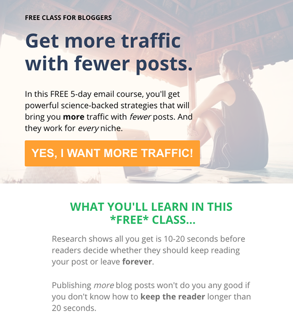
For example, on the landing page shown above, I offer a lead magnet that’s a free 5-day email series. And 65 percent of people who land on this page—nearly two-thirds of people who see it—end up subscribing.
Because when you remove every distraction and you build the value of subscribing, you help the reader envision what they’ll get when they subscribe. So subscribing is simply the logical next step for them to take.
How to Send Readers Through a Landing Page Gateway
You can share links to your landing page on social media, or you can link to it from the content on your site.
Basically, any time you refer to your lead magnet or refer to the value of subscribing to your list, link to that landing page. Then when the reader follows the link and sees the landing page, they’re more likely to subscribe than if you’d just included an embedded subscribe box their eyes skipped right over.
The Real Advantage of Landing Pages
When your readers start sharing your landing page with their friends, that’s when the magic happens. They can tell people about you and send them to the page, and their friends are much more likely to follow up and subscribe, compared to if they’d just sent their friends to your site in general.
Your Next Step: Prioritize
We’ve covered a lot of ground in this lesson, so now it’s time to prioritize.
If you have only one subscriber gateway so far, then choose one or two more and add them to your to-do list. If you already have a handful of gateways in place, look for another you can add.
You’ll get the best results when you have several gateways on your site, but remember that the most important part of any gateway – no matter what form it takes – is the messaging.
Take everything we covered in the last lesson about your gateway messaging, choose one or two tools from this lesson, and open up at least ONE new gateway on your site.
Opening more gateways (with on-brand messaging!) means you’ll start capitalizing on more of your incoming traffic because you’ll be converting more of those visitors to subscribers who will keep coming back for more.
The Best Tools for Your Email Strategy
Email Marketing Tools
In case you missed this earlier in this module, here’s a common question you may have at this point in the program: Which email marketing tool is best for your business long-term? This is the foundation that all your gateways will build upon, so it’s important to use an email marketing tool that will integrate with whichever gateway tool(s) you choose.
Ultimately, as long as your email tool is delivering your messages to your subscribers so you can serve your target market, that’s what matters most. No “perfect” email tool exists because they all have their pros and cons, so you’ll need to make a CEO decision on what’s best for you.
With that said, I personally have used and can recommend both ActiveCampaign and ConvertKit. I personally prefer ActiveCampaign because it gives you more power over analyzing your subscribers and segmenting your audience based on their actions. Neither tool is perfect, but both get the job done well.
You can find more cost-effective tools out there, but as your business grows you will likely find that you want to move to a professional-level email marketing tool.
For example, I started out with one of those email tools that’s free until a certain number of subscribers, but as my list grew, my needs outgrew what that lower-cost tool could provide. I wasted a lot of time and energy trying to work around that tool’s limitations when I should have just bit the bullet and upgraded to a professional-level tool instead!
Gateway Tools
Below, you’ll find recommendations for high-quality tools you can use to open more gateways. Below each tool in this section, you’ll find a list of all types of gateways. If that tool supports a type of gateway, the gateway name is formatted in plain text. If that tool does not support that gateway type, the gateway name is formatted in strikethrough text like this. Warning: The feature sets for these tools change regularly, so always refer to the tool sites for the most up-to-date information about features included.
When selecting a tool, keep in mind that one drawback of going with a tool that does several different things is that it’s likely not the best at doing all those things – kind of like a “jack of all trades, master of none.” On the other hand, tools that specialize in a certain area tend to have a more robust set of features in their area of specialty.
LeadPages
This is a professional-level tool that focuses on how to drive new leads for your business, from sales landing pages to gateway features and more. It’s easy to use and customize, which is perfect if the tech side of blogging isn’t your favorite. Plus, the feature set goes beyond what we’ve discussed in this lesson. For example, one feature called “Leaddigits” allows you to invite your readers to subscribe via SMS text messaging.
However, the investment for this tool is significant, so it’s not for everyone. I personally use LeadPages for my landing pages and some of my gateways.
Feature Box- Hello Bar (called “Alert Bar”)
Header Subscribe BoxSidebar Subscribe Box- Pop-Ups + Slide-Ins
End of Post Subscribe BoxFooter Subscribe Box- Lead Box
- Landing Page
Thrive Themes
This suite of tools has a ton of features like A/B testing and robust analytics, and many bloggers prefer it because you can pay a one-time fee instead of an annual fee. However, the one-time fee includes just one year of support and you have to purchase each tool separately in order to pay the one-time fee. So some bloggers prefer to join the Thrive Membership program, where you get access to all their tools and ongoing support with a monthly fee. To access many of the gateway features listed below, you’ll want the Thrive Leads tool, but many bloggers prefer to also use the Thrive Architect drag-and-drop page builder as well.
Also, beware that because Thrive has a ton of features, it can take some time to figure out exactly which feature you need to adjust to get your gateway looking exactly how you want it. But after you create a couple gateways and get them all configured how you want them, you can reuse them as templates for any new gateways you create.
- Feature Box (may require Thrive Architect)
- Hello Bar (called “Sticky Ribbon”)
- Header Subscribe Box (may require Thrive Architect)
- Sidebar Subscribe Box (may require Thrive Architect)
- Pop-Ups + Slide-Ins
- End of Post Subscribe Box
- Footer Subscribe Box (may require Thrive Architect)
- Lead Box (called “2-Step Opt-In Form”)
- Landing Page (requires Thrive Architect)
OptinMonster
This tool specializes in opt-in gateways and has a robust set of features focused on that one task of getting new subscribers on your list. For example, this tool keeps track of what readers have already downloaded and doesn’t show them the same lead magnet offer again. This is powerful because you can show incoming visitors your lead magnets – and then after they subscribe, use those same areas on your site to lead them to the products you offer. However, some bloggers have reported that OptinMonster sometimes slows down the load time for their sites.
- Feature Box
- Hello Bar (called “Floating Bar”)
Header Subscribe Box- Sidebar Subscribe Box
- Pop-Ups + Slide-Ins
- End of Post Subscribe Box
Footer Subscribe Box- Lead Box (called “MonsterLinks 2-Step Optins”)
Landing Page
PopupAlly
This WordPress plugin is more cost effective than OptinMonster but the feature set isn’t as robust.
- Feature Box
- Hello Bar (called “Top Bar”)
Header Subscribe Box- Sidebar Subscribe Box
- Pop-Ups + Slide-Ins
- End of Post Subscribe Box
Footer Subscribe Box- Lead Box (called “Lightbox Modal”)
- Landing Page
HelloBar
» HelloBar
This gateway tool is currently free up until 5,000 new subscribers a month, so it can be a great way to get started with opening more gateways without an upfront investment. However, the free version might require that you display the HelloBar branding on your gateway.
Feature Box- Hello Bar
Header Subscribe BoxSidebar Subscribe Box- Pop-Ups + Slide-Ins (called “Modals” and “Sliders”)
End of Post Subscribe BoxFooter Subscribe BoxLead BoxLanding Page
Your Designer or Developer
As another option, you can ask your designer or developer to help you open more gateways. Your designer or developer can typically create a gateway that integrates seamlessly with your website’s existing design.
Steps to success…
[progressally_objectives]